The book “Letters of the 20th Century” · March 2026 · research 07
The Bannikova case, or Was there a plan? Soviet type designers, 1930–1960
Task
Biographies of the designers of metal typefaces, 1930–1960, a catalogue of typefaces, typology, whether there was a state plan for type development; revision — short biographies and corrections.
What was done
Two-step prompting: the model first acts as a brief specialist, writes the terms of reference itself and asks eight questions about depth; then the research runs. Three runs — the first two with errors, the third went into the chapter. Revisions — the same day.
Tools
ChatGPT Deep Research
Where to look
Below are the briefs the models received, the finished reports in PDF and documents, and the publications made along the way.
Briefs
What exactly the model received
Brief for Deep Research and eight clarifying questions
My document · working project document · 10 March 2026
PROMPT FOR DEEP RESEARCH
Research topic
Soviet designers of metal typefaces and the system of type design in the USSR (1930–1960).
Context
Carry out an in-depth historical and typographic study of the development of metal typefaces in the USSR, 1930–1960. The focus is the biographies and professional work of Soviet type designers, and the system for developing and introducing typefaces. Special attention to the Department of Typefaces at VNII Poligrafmash (the All-Union Research Institute of Printing Machinery).
Key figures
Solomon Telingater, Rerberg, Kudryashev, Kudryasheva, Bannikova, Lazursky, Kuzanyan, Bazhanov, Pozharsky (check that the name is correct). Do not limit yourself to the list — identify other significant designers.
Main research tasks
1. Biographies and professional trajectories — education, places of work, involvement in type development, collaboration with Poligrafmash, state projects, publications. Comparative analysis: who was more influential, who had more typefaces put into use, what factors shaped careers.
2. Catalogue of Soviet metal typefaces (1930–1960) — name, designer, year, organisation, type, field of use, how widespread, whether specimens exist. Especially: book, newspaper, technical, educational, decorative and display typefaces.
3. Typology — romans, grotesques, transitional, newspaper, display, specialised; which types were developed in sufficient numbers and which were missing.
4. The system of type development in the USSR — did a state plan exist; how assignments were formed; which institutions took part; the role of VNII Poligrafmash; how introduction worked. How centralised, well thought-out and successful the system was.
5. Demand — which typefaces were most in demand, which were considered the standard.
6. Comparison with world typography — USA, Britain, France, Germany; alignment with the trends of modernism and functional typography; foreign prototypes; original solutions.
7. Originality vs borrowing — which typefaces are original and which are adaptations of Western typefaces.
Sources
Soviet type catalogues, Poligrafmash archives, typographic manuals, books on typography, publishers’ archives, museum collections, academic publications, foreign research; images of typefaces, print samples, archival documents.
Format of the final report
- Catalogue of Soviet metal typefaces 1930–1960 (table)
- Biographies and comparative analysis of the designers
- Analysis of the typology
- Description of the institutional system
- Comparison with Western typography
- Conclusions: strengths and weaknesses of the Soviet type school, degree of originality
Additional requirements
References to sources; archival and academic sources; images of typefaces; avoid superficial overviews; special attention to specific typefaces and their use in real print.
The model’s clarifying questions (second step)
“Yes, I do have questions — and they are critically important. The prompt is good now, but for book-level Deep Research it can be strengthened roughly three- to fourfold.”
- Geography of sources: Soviet/Russian only · global · archives + academic + museums · everything possible (I recommend 4)
- Level of depth: popular overview (10–15 pages) · popular-science chapter · historical-scientific study · almost dissertation level
- Archival catalogues of Soviet typefaces: no · only well-known typefaces · the fullest possible list
- Type specimens (scans of type sets, book pages, catalogues): no · desirable · yes, mandatory
- Specific publications (books, newspapers, magazines where the typefaces were used): no · sometimes · yes, systematically
- Plans for developing the Soviet type system (state plans, standards, GOSTs): no · if they come up · yes, mandatory
- What matters more for the book: biographies · the typefaces themselves · the institutional system (Poligrafmash) · everything equally
- Time range: strictly 1930–1960 · 1920–1970 (origins and consequences; I recommend 2)
“Just answer with a list of numbers… After that I will make a strong version of the Deep Research prompt that can really pull rare data out of archives and catalogues.”
Results
Reports and documents
Publications
Posts about this research
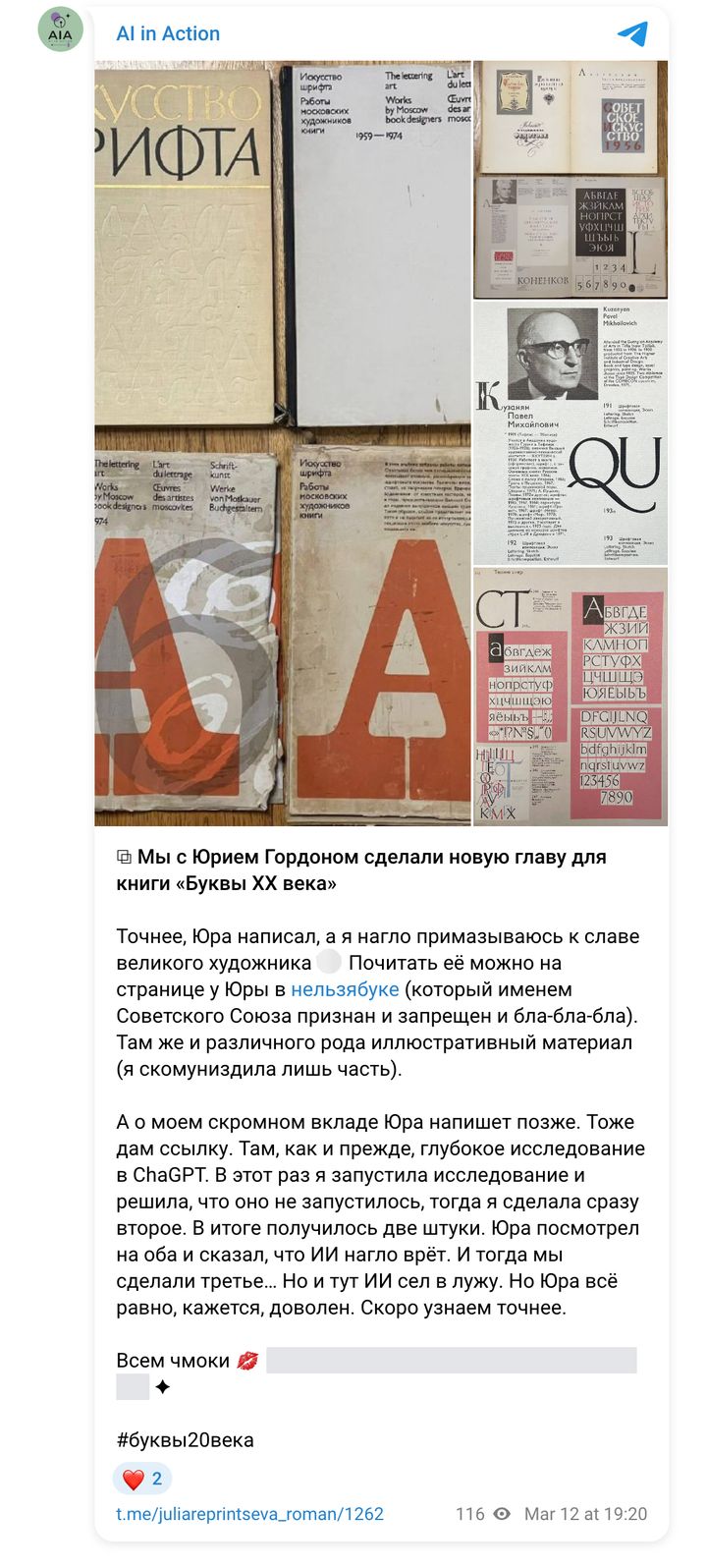
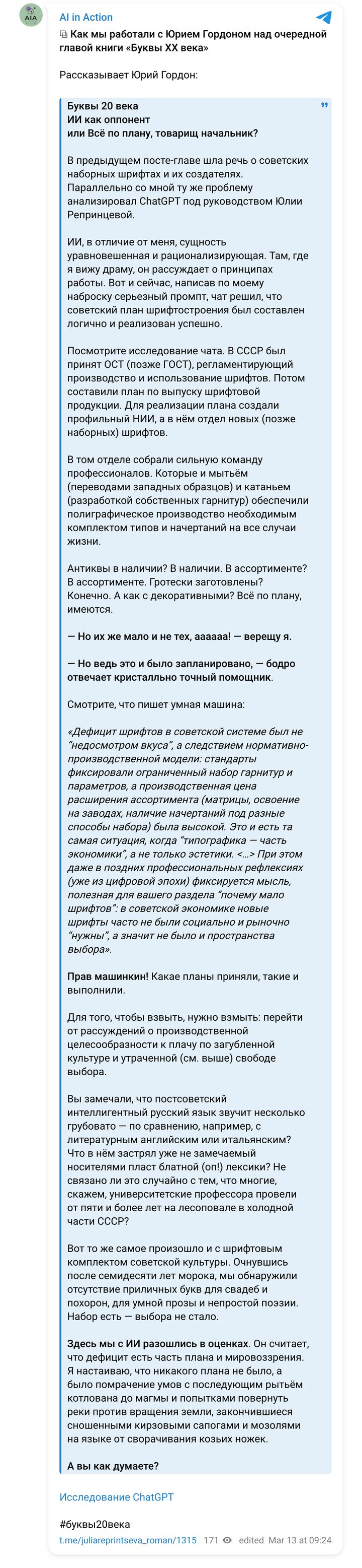
Yuri Gordon and I — about this work in our own channels (in Russian). Each post links to the original.