← Portfolio JRJulia Reprintseva
RU

Catalogue · personal archive · 1990s – 2000s

Fonts. 2288,
a specimen of each

A Cyrillic collection of the 1990s–2000s: Arsenal, ParaGraph and ParaType, Type Market, SoftUnion, the Gophmanns, Zeifert — plus Bluemlein calligraphy. Search by name or file, filter by author, type, licence and section, try on your own text. Specimens show the Russian pangram «Съешь ещё этих мягких французских булок» (every letter of the alphabet) or “The quick brown fox…” for Latin fonts.

2288font files in four sections
1858with Cyrillic — cover ≥ 90 % of Russian letters
1572unique families
235handwritten and calligraphic
How to use the catalogue
  1. Search and filter. Search by name, author and file. The filters — section, author, type, licence — depend on each other: each list shows only what exists in the current selection, with counts; pick “calligraphy” and only Sudtipos remains among the authors. Tick “Cyrillic only” if your text is Russian. Authors are ordered by significance for the collection: Russian studios of the 90s first, then the global foundries, then individual authors, “others” last.
  2. Read the notes. Select an author or a section and a card appears above the list: who, when, what studio. Fonts from films, games and brands say what they imitate under the name.
  3. Try on. The “Try” button sends a font to the Fitting room (panel on the right). Type your own text — a name, a headline, a line — and see it in all the chosen fonts side by side, rendered from the real files, not pictures. Assign one font as the heading and another as the body: a mini-page assembles below. Remove a font with “remove”, everything with “Clear”. The selection lives while the tab is open. In this public version only the free fonts (232) can be tried on: commercial font files are not published on the site, they carry the tag “try locally”. The full Fitting room works in the local copy of the catalogue.
  4. Learn the tags. The same phrase for every font — so they are easy to compare. “Capitals only” — the font has no lowercase. “No specimen” — the file has no letters, only symbols. “Can’t try in browser” — an old file the browser refuses to open (it works in Word and Pages). “Cyrillic · cp1251” — an old encoding; the Fitting room handles it by itself. The type of old fonts is often “undetermined” — look at the specimen.
  5. Take it into your layout — mind the rights. The licence tag — free, commercial, unspecified — comes from the notice inside the file, not from a legal check. Drafts and personal projects: anything goes; client websites, print and logos: buy commercial fonts or replace them with free ones (list at the bottom of the page).
Where the collection comes from and who made it

The collection comes from the bundles of Cyrillic fonts that circulated among design studios in the 2000s, kept since the years I worked as a typesetter at a print shop. Together these files form a snapshot of the Russian type scene of the 1990s–2000s: the letters that dressed cassette covers, newspapers and the first websites. Attribution was restored from the copyright notices inside the files; 138 ParaType fonts carried an Adobe copyright instead of the author — a converter’s trace, corrected.

  • The Gophmanns — 180. Alexandra and Anatole, 2004–2007. Cyrillic redrawings of vintage and handwritten fonts, which the author gave away for free.
  • Type Market — 148. Moscow, 1993–1998, Andrey Kustov. Decorative Cyrillic for advertising and signage.
  • Arsenal Company (a_ fonts) — 620. Moscow, 1996–1997. The fonts with the a_ prefix (a_Futurica, a_AlbionicTitul) that lived on every computer of the 90s.
  • ParaGraph (Tarbeev) — 193. 1990–1997, Alexander Tarbeev, Vladimir Yefimov. The first professional digital Cyrillic typefaces.
  • SoftUnion (Vsesvetsky) — 96. Nikolay Vsesvetsky, 1993–1995. Cyrillic versions of display typefaces.
  • ParaType — 152. ParaGraph’s successor. Newton, Pragmatica, Baltica, Academy, Lazurski — the gold reserve of Russian typography.
  • Tilde / AG Fonts (Riga) — 57. Riga, 1991–1995. Cyrillic and Latin with Baltic letters.
  • Ivan Zeifert — 23. 2003–2006. Original decorative Cyrillic.
  • Nikolay Dubina — 61. D-Studio, 1997–2002. Cyrillic versions of American sign-painting fonts.
  • Sudtipos / Bluemlein — 32. Alejandro Paul, 2004–2006. The Bluemlein collection: flourishes by American letterer Charles Bluemlein from the 1930s, digitised by an Argentinian; each font has an invented name — Mr Canfields, Miss Fajardose, Mrs Von Eckley.
  • Ray Larabie — 21. Canada. Free fonts, even for commercial use.
  • 705 more — small authors, 90s freeware, foundries with a single file or two, and files with no author at all.

1572 unique families, 1858 with Cyrillic. In 62 of them the Cyrillic is hidden in the old Windows-1251 encoding — by their tables they look Latin; they were found by comparing the drawings of the letters.

Rights

The licence is determined from the notice inside the file (the copyright), not from a legal check: “free” — there is explicit permission (OFL, “distribute freely”, free authors such as Ray Larabie); “commercial” — a known foundry or “All rights reserved”; “unspecified” — no author named or the file was generated by an editor. The collection holds no purchased licence for any commercial font.

Drafts, personal projects and posts: anything goes. Client websites, print, logos and anything sold: buy commercial fonts (ParaType — from about 1,500 ₽ per style) or replace them with free ones: text faces with Cyrillic — Inter, Manrope, Golos, PT Sans/Serif, Onest, Lora, Literata; handwritten and calligraphy — Caveat, Marck Script, Pacifico, Lobster, Bad Script, Neucha; display — Rubik, Unbounded, Russo One, Press Start 2P. All on Google Fonts, free for commercial use too.

Proof by typesetting

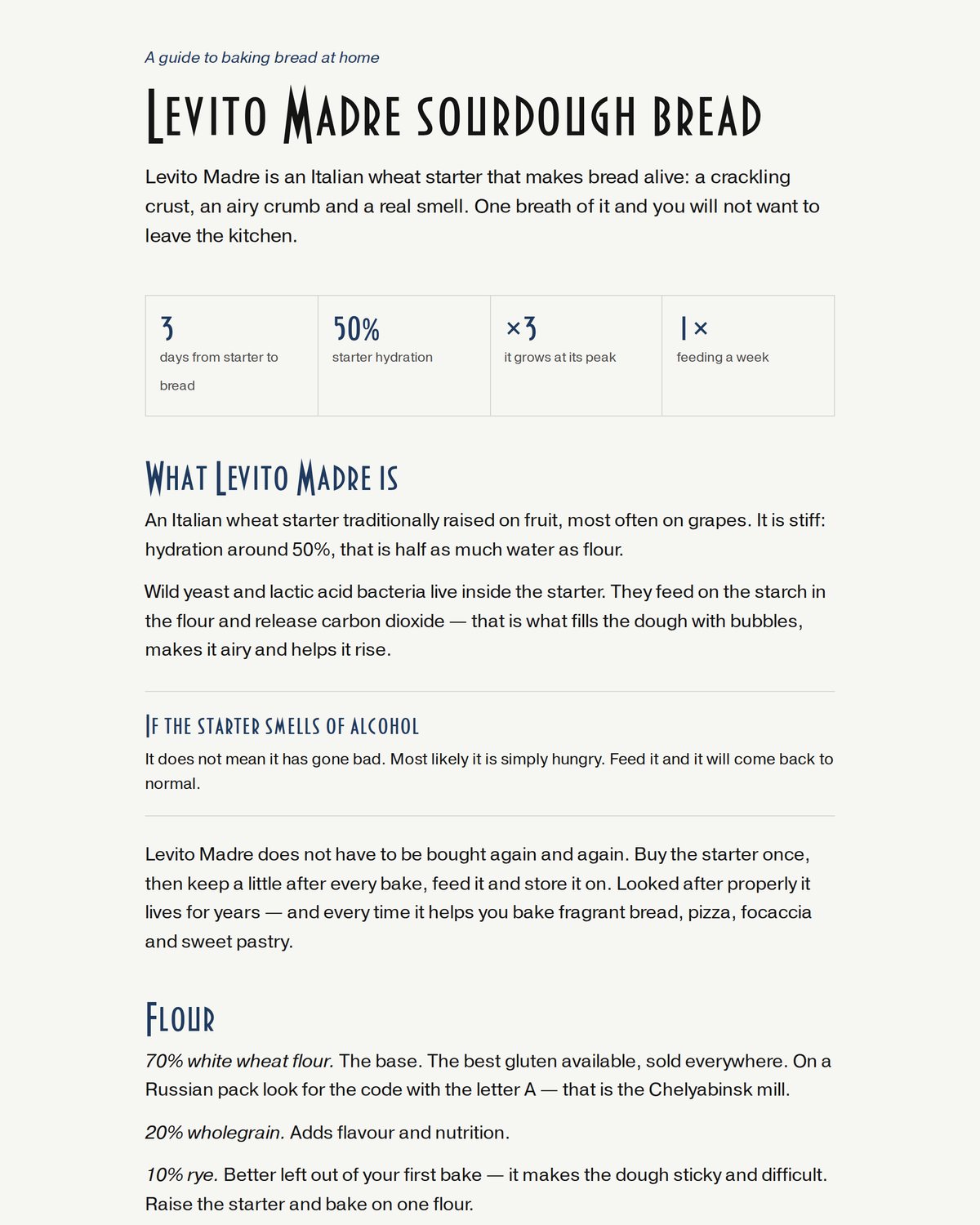
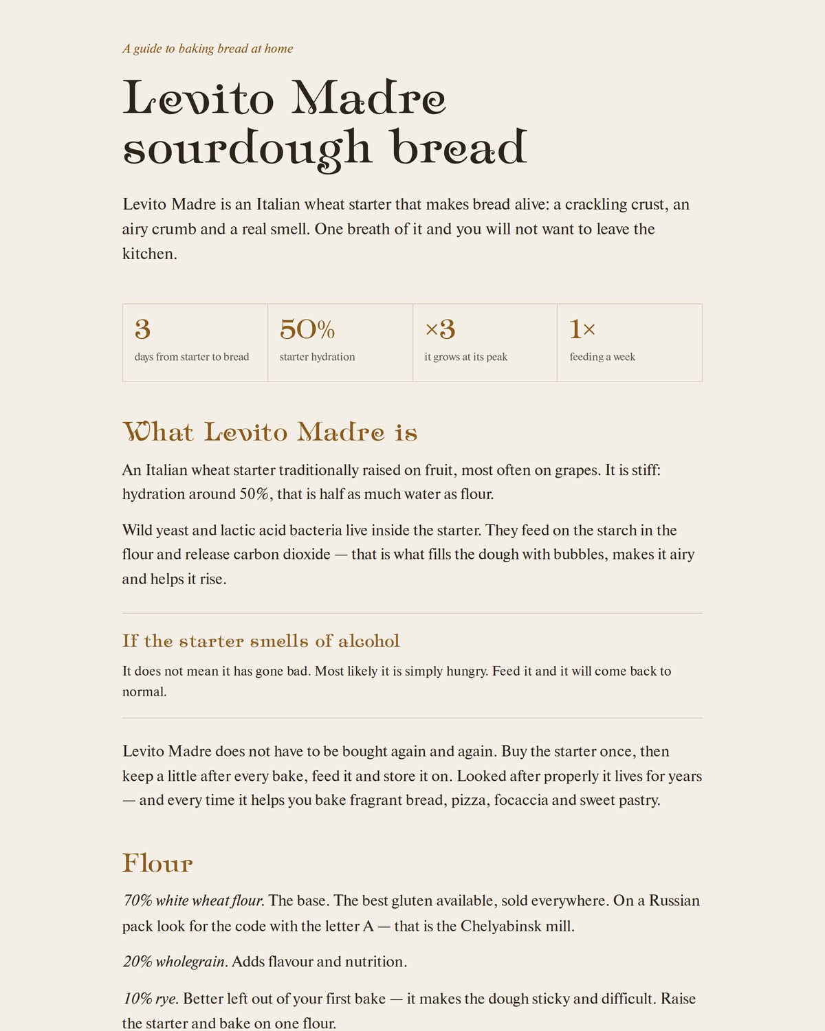
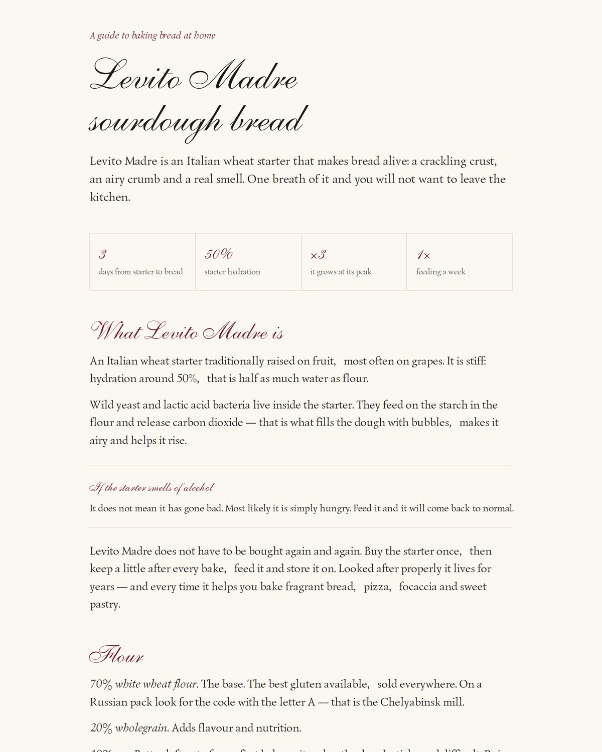
A catalogue is a shop window; the only real test is typesetting. The same sourdough bread guide is set in three font pairings from the collection. The pairs were chosen by the AI following a skill — an instruction for Claude that says where the collection is, how to search it and by what rules to pair: no more than two fonts, a heading with character plus a calm text face, both from the same era. It is enough to say “typeset this invitation in a 1990s mood” — and it takes fonts from here, not from the internet, and shows the options as pictures. I chose with my eyes: the rules take care of the trial and error, the decision stays with a human.
Bread guide: Ampir Deco and Newton
Ampir Deco (Gophmann) + Newton (ParaType) — art deco
Bread guide: Allegretto Script and Lazurski
Allegretto Script + Lazurski (ParaType) — calligraphy and serif
Bread guide: Bankir Retro and Pragmatica
Bankir Retro (Gophmann) + Pragmatica (ParaType) — newspaper page
↑ top